Website Colors
How important is your choice of website colors?
Your choice of website colors is one of the most important decisions you will make in designing and building your website, apart from your words and content of course.
The Internet is primarily a visual medium and color is the easiest and most advantageous way to get your message across to your visitors.
Understanding color psychology and the subconscious and subliminal
effect of color on the emotions, can help you make an informed decision on your best choice of colors in the creation of a better website
to capture the attention of your visitor, and potential customer, and
add meaning, simplicity, clarity and power to your website design.
Here is a list of the major points to take into account in choosing your website colors:
1. Understand the psychological meanings of your choices for website colors
- Red is attention-getting
More on meaning of colors in business....
2. Have knowledge of the impact of your website color choices on other cultures
With the worldwide influence of the Internet, cultural meanings of color are no longer as important. Western meanings are slowly becoming more accepted all over the world. Still, it would pay you to be aware of any cultural differences in meaning if you are selling to a particular country or ethnic group.
For more on the cultural meaning of colors and color symbolism……
3. Find the best website colors to attract your target market
Different colors appeal to different markets. Men tend to prefer different colors to women, children prefer brighter and simpler block colors to adults, teenagers have their own preferences, some are appropriate to corporate businesses, some to beauty shops, some to gift shops and some to fast food outlets.
- People in tropical countries prefer brighter and warmer colors
- People in countries with cooler climates prefer cooler colors
- Young children prefer bright primary and secondary colors
- Well educated people prefer tertiary colors and more sophisticated colors with unusual names
4. Choose the best colors for your text, links and images
If you understand the messages your website colors are sending, you can use color to your advantage to direct your visitor around your web page, to encourage them to make a purchase decision, to create unity and coherence on your website and to create a unique brand for your business.
- Red calls for action to be taken and directs visitors around your site
- Green assists decision-making
- Blue suggests credibility and honesty
- Indigo implies sincerity and integrity
5. Choose the background color for readability of all text written on it
- The best choice for background color is probably white as it provides the most readable background for most text colors, except yellow and very pastel colors
Read about the psychological meanings of color in business to choose the best colors for your text and background.
Remember to:
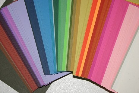
- Keep your website simple and clear by limiting the number of colors you use.
- Choose 2 to 3 main colors and use shades and tints of these colors to make your website look interesting.
While this is not intended as a 'how to' for your website, this information will give you the knowledge to make an informed decision regarding your color choices.
At the least, if you are using a web designer, with the knowledge available on this website, you can work in conjunction with them to find the best colors to communicate your message.
To return from Website Colors to Business Color
To return to Home Page
Like to join our Facebook community?

For more information
on color and:
your website
your marketing, advertising and promotions
your retail business
your office
your business stationery
your product packaging
your business clothing
your target markets
business cultural associations

For more information on:
Copyright © 2009-2018 empower-yourself-with-color-psychology.com
All Rights Reserved
New! Comments
Have your say about what you have just read! Leave me a comment in the box below.