Packaging Colors
Packaging colors are one of the elements that will set your business apart from others and your choice of colors will set your product apart from your competitors' products. The colors you choose should send the right subliminal messages to inspire any potential customer to buy your product.
Color is the best way to reflect and enhance a unified image and branding of your product as it is such a visual medium.
Your choice of colors should relate to your logo and reflect the image you are sending to the market place to attract buyers.
Don't make the mistake of choosing your favorite color without checking the subconscious messages of the color first. It might be a great packaging color but just inappropriate for your business image.
Making the Right Choice for Your Packaging Colors
In making the right choice of colors you need to:
- keep the consumer of your product in mind, your target market - put yourself in their shoes to see what motivates them to buy - what is their age, their gender, their economic status, their education level
- determine the purpose of your product and what message you want the packaging to send to your buyer - is the message professional, serious and conservative, is it about health and well-being, is it to make the customer feel good, is it to help with a problem, is it about luxury, is it about elegance and sophistication - make sure the colors send the right message!
- understand any cultural preferences of your target market as well as any cultural meanings attached to your color choices before making your selection
- select the colors based on the message you want to send to your target market together with the above information
- a way to stand out from the crowd (or your competition) to grab the attention of your buyer
- test your color packaging in the market place to determine its success and make changes if necessary.
White Packaging
In color psychology, white is the blank canvas waiting to be written upon. It relates to innocence, equality and new beginnings.
As a packaging color it is safe, basic,
unadventurous and conservative, but a good choice where you want to create the impression of cleanliness, purity, efficiency or simplicity.
By adding printing or decoration in another color you can create any
number of different messages:
- adding red suggests excitement and draws attention to the product
- yellow decoration implies a more light-hearted, happy and fun product
- black decoration or printing adds a feeling of sophistication and prestige.
Use creative and/or colored decoration to set you apart from your competitors.
The more colors you use for your packaging colors, the less serious the product - a simple combination of two colors can look more elegant and classy, depending on the type of decoration of course.
Black Packaging
Black is the color of power, authority and control. It tends to stand out when used as a packaging color as it makes products appear heavier and more expensive and transmits a higher perceived value.
Black adds a
degree of mystery and intimidation on one hand and elegance and class on
the other.
You can choose printing or decoration
for the black packaging in any other color that psychologically sends
the message you want to send to your potential customers:
- adding gold to the packaging creates elegance and sophistication to attract a wealthier market
- silver has a similar effect
- black with red has an adult or sexual connotation; however people of Spanish background like the combination of black and red as it is a part of their heritage
- adding pink softens the message and attracts the female market
- magenta makes it more striking and attractive to the non-conformists and more creative customers
- the brighter the colors you add to the packaging the less serious it becomes.
Blue Packaging
Blue relates to trust, honesty and reliability, strength and unity. When used in your packaging colors it communicates trust and reliability in the product.
The darker the blue, the more professional, serious and conservative the product will be perceived to be.
The lighter the blue the softer and more creative the product will be perceived to be.
Blue can indicate a product that will contribute to the buyer's relaxation and calmness.
Younger people often see blue to be a color for more mature people so avoid its use if trying to capture the youth market, unless you choose the brighter, more neon or electric blues.
Of course you need to take into account that universally blue is the most liked color by both males and females and therefore the safest color to use, although it is often considered boring and predictable. Just choose the right blue that relates to your specific market.
Red Packaging
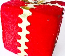
In color psychology, red means energy, action, passion, excitement and strength.
Using red for your packaging colors draws attention to your product, stimulates the senses and excites the potential purchaser.
Dark reds are perceived as professional and luxurious, while bright
reds are more exciting and energetic and generally of lower perceived
value than dark reds. Adding gold or silver for the printing or
decoration increases the perceived value.
Blue-reds are more attractive to the upper class market, while orange reds are attractive to the working class - orange reds have a lower perceived price and value.
Adding black decoration to your red packaging can add sexual or adult connotations.
Green Packaging
Green is a color of balance and harmony of the mind, the body and the emotions. In color psychology it relates to security, wealth and growth.
For packaging colors, green suggests natural, organic and healthy, a good color to use for environmentally friendly products.
Dark green implies wealth, luxury and professional quality. Adding some silver adds elegance and sophistication.
Muted greens suggest environmentally safe and wholesome.
Mid green packaging is appropriate for organic and ecological products, wholefoods, garden and golfing products.
Add decoration or printing in other colors that will attract your target market.
Orange Packaging
In color psychology, orange means adventure, optimism, self-confidence
and sociability. It is enthusiastic, extroverted and uninhibited.
Orange packaging suggests affordability, fun and adventure. There is
almost a degree of risk in buying a product in orange packaging - will
it be something different, an adventure, quality at an affordable price,
or just something cheap and poor quality.
While some variations of orange can give the impression of cheapness, adding another color to the packaging can change the message and increase the perceived value:
- add dark blue to suggest reliability and trustworthiness
- black decoration increases the perceived value of the product.
Yellow Packaging
Yellow is cheerful, optimistic and uplifting to the spirits. It inspires original ideas and creativity. Stimulating to mental abilities, it aids in decision making.
In packaging colors yellow
suggests either something original and innovative or a cheap, fun
product. With its positive and happy energy it attracts children and
young adolescents.
Products that aim to lift people's spirits would be appropriate in yellow packaging.
Turquoise Packaging
Turquoise, in color psychology, means clarity of thought and
communication. It calms the emotions and recharges the spirit,
invigorating depleted energy levels and inspiring positive thought.
Turquoise is a good color for health clinics and practitioners as it balances the emotions and calms the spirit.
Using turquoise as the packaging color for cleaning products is ideal as it reflects cleanliness and purity without being too sterile.
Turquoise is generally suitable for both males and females, although males are more attracted to a deeper variation of turquoise such as teal.
Your printing or decoration color can also change the appeal of
turquoise:
- adding black strengthens the look, adding dark blue makes it more conservative
- adding pink makes it more appealing to the female market
- adding red makes it a more exciting attention-getting package.
Purple Packaging

Purple relates to high ideals, imagination and spirituality. Using purple in your packaging colors implies luxury, extravagance, premium quality or uniqueness, particularly if used with gold or silver printing or decoration.
'New age' products are often packaged in purple to suggest
individuality, originality and uniqueness. With purple being the union
of body and soul, it is appropriate for packaging of holistic products
and anything to do with spirituality.
Purple tends to be more attractive to the female and youth market, although it is slowly becoming more acceptable to males.
Lighter purples imply fantasy or nostalgic products.
Adding different colors for printing or decoration will add to the
messages of the purple:
- silver or gold adds luxury, prestige and quality
- adding red adds energy and excitement
- magenta adds liveliness
- green or blue will add a feel-good impression.
Magenta Packaging
Magenta is a strong and inspiring color which can appear outrageous and
shocking on one hand or innovative and imaginative on the other.
If you want your packaging colors to have an impact that says outrageous and lively in a positive way, magenta will do it for you!
Adding some dark blue, for example, in printing or decoration, to the magenta packaging will tone down its energy, as will dark green, dark gray or black.
Silver or gold will add a degree of elegance and sophistication to the product.
Pink Packaging
Pink is inspiring, warm, compassionate and comforting, suggesting hope for the future. It is calming and non-threatening.
Pink packaging is generally most appropriate for products relating to the female market such as cosmetics, fashion, beauty and romance.
Pink is feminine and youthful in its softer shades, with more passion
and energy in its deeper shades. Combining pink with darker colors gives it more sophistication and strength.
Using brighter pinks for your packaging colors tends to suggest a less expensive and trendy product which is attractive to the teenage and pre-teen market.
Dusty or muted pink packaging attracts a more sentimental and older market. Adding silver decoration adds elegance to dusty or muted pinks.
Gold Packaging
Gold packaging suggests expensive, luxurious and high quality. However
your product should reflect this high standard or you will lose
credibility - a poor quality product inside gold packaging will appear
cheap and have the same effect as fake gold!
You can change the
message you are sending with your gold packaging by adding a different
color for the printing or decoration:
- red will add an element of excitement
- black will suggest elegance and sophistication
- dark blue will add a more serious and professional look.
Silver Packaging
Silver packaging implies elegance and sophistication. It is more gentle than gold and it combines well with almost all other colors illuminating anything printing or decorating on the packaging.
Silver combines well with most other colors;
dark blue decoration will suggest a conservative and trustworthy
product, purple decoration will suggest luxurious and unique, black
decoration will suggest serious and sophisticated.
Combined with black, dark blue, dark red or dark green, silver packaging is elegant, classy and professional.
To give silver packaging a modern hi-tech look, combined it with blue, turquoise, black or dark gray.
Gray Packaging

Gray is a conservative color signifying neutrality,
indifference and reserve. It lacks energy but serves well as a
background color, allowing other colors with it to take prominence.
Gray is a safe color to use as a packaging color. It is neutral and serious and can be combined with almost any other color to impart different messages and to reach different target markets.
Adding
red gives gray more energy and excitement, adding dark blue makes it
look more professional, adding black gives it a more sophisticated
appearance, adding gold makes it more luxurious.
Light gray packaging combines well with all other colors and can create a modern and hi-tech look when combined with turquoise, light blue, dark blue or yellow.
Brown Packaging
Psychologically, brown is associated with strength and solidarity, comfort and earthiness, maturity and reliability.
As a packaging color, brown is appropriate for products that suggest wholesome and organic, safety, or comfortable and homely.
We are all used to brown
cardboard boxes and these give the impression of basic, practical and
boring, so in using brown for your packaging you need to be careful of the brown that you use and add colors which will improve the look of the package and inspire your customer to buy.
To give your business a truly individual and unique identity with your packaging colors, read more about the psychological meanings of color in business and choose the colors that truly reflect your own unique situation.
To return from Packaging Colors to Business Color
Tor return to the Home Page
Like to join our Facebook community?

Copyright © 2009-2018 empower-yourself-with-color-psychology.com
All Rights Reserved
New! Comments
Have your say about what you have just read! Leave me a comment in the box below.