Business Cards
Using Color Psychology to Enhance
Your Business Cards and Stationery
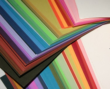
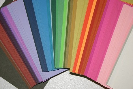
Your use of color is one of the elements that will set your business cards apart from others.
Your logo and your cards are often the first introduction a potential customer has to your business, so they should send the right subliminal messages to inspire any potential customer to do business with you.
Any business stationery, along with your product packaging should reflect a unified image and branding and color is the best way to achieve and enhance this as it is such a visual medium.
When choosing the colors for your business cards, you need to understand the psychological meanings of color in business and the market you are targeting.
Of course you need to take into account your own personality and to reflect it in your choice of colors but you will probably do that when you choose the logo and branding of your business.
Don't make the mistake of choosing your favorite color without checking the subconscious messages of the color first. It might be a great color but just inappropriate for your business image.
White business cards are standard, safe and conservative and used
by a majority of businesses as a part of their business stationery.
Most cards use white as their base so if you want to stand out from the
crowd white is not the best choice unless you have a logo and colors
that will stand out and distinguish you from all the others.
A white card is a blank canvas, so you can be as creative as you wish -
just make sure it sets you apart from your competitors.
The more colors
you use on it and the lighter the colors, the less serious your business
image will be.
White is suitable for almost all business cards and most target markets but it may not be the best choice if you really want to stand out.
Black business cards are powerful and serious. They can suggest sophistication and elegance on one hand, and mystery and intimidation on the other.
A black business card tends to stand out amongst white and all other color cards.
Adding silver, gold or white printing to a black card can look classy
and elegant and is very impressive as long as it sends the message you
want to send and you get the response you want.
You can also choose printing in any other color that psychologically
sends the message you want to send to your potential customers. Bright
red, blue, green, orange, yellow, turquoise, pink, magenta or light
purple all look very effective on black cards, depending on your
business and the messages you want to send.
The more color you add to the black the less serious the card becomes.
Blue cards convey a message of honesty and trustworthiness.
Blue implies reliability, responsibility and conservatism. It suggests a
sense of calmness and tranquillity, promoting physical and mental
relaxation.
Blue enhances one-to-one communication so it would be a good choice for a
professional counsellor, a psychologist, an accountant or financial
advisor to use for their business card.
The darker the blue, the more professional, serious, authoritative and conservative it is.
The lighter the blue, the less authoritative and
conservative it is - there is more freedom and creativity in pale blue.
Choose mid to dark blue if you want to promote that you are a reliable and trustworthy business, are ambitious and determined.
Red cards indicate a business which is action oriented and passionate.
Red is attention-getting and stimulating to the physical senses, so it
is appropriate for fast food businesses and any business that involves
speed or action.
On the negative side, it implies anger, aggression and revenge.
To use bright red as your card color you must be a very confident and assertive person seeking immediate attention.
For most businesses, incorporating some red in the logo or the printing
is enough to indicate passion and excitement for the business.
Dark red, burgundy and maroon are the most professional reds, although
less controlling and less conservative than black. These darker reds are
appropriate for professional businesses with a more dramatic yet
serious image, such as lawyers or stockbrokers.
Green cards suggest balance, security, wealth and growth.
Green is associated with nature, health and healing, and the environment, with a sense of compassion and nurturing for all.
The darkest greens are often preferred by the wealthier sections of the
community and impart a message of professionalism and wealth creation.
Mid greens suggest emotional balance and harmony, and are nurturing and
relaxing, a good choice for a business card for environmental type
businesses, gardening and golfing businesses, social workers, charity
workers and counsellors.
Muted greens suggest natural, organic and ecological businesses.
Of course you must take into account that a lot of people have negative
responses to green, even though it is a universal healing color and
abundant in nature.
Orange cards are very optimistic and positive. They suggest affordability without compromising on quality.
Orange is stimulating to the senses so it is a good color for businesses
relating to food, social communication and interaction, such as
restaurants and community groups.
Orange also sends an adventurous and spontaneous message so it would be a
good choice for cards for an adventure company, a gym, a travel
business or a mountain climbing business.
By adding another color to the card, such as in the printing or logo,
you can change the message to meet your requirements. For example, an
outdoor adventure business might choose an orange card with green
printing. I know of a successful auto recovery and wrecking business
that has used orange with royal blue to suggest it is honest and
trustworthy but also affordable - it is a very successful business.
Yellow cards are uplifting and stimulating to the mind.
Yellow relates to the logical mind but is also playful and enthusiastic.
It stimulates our mental faculties and aids in decision making.
Yellow is a good color for communication on a mental level so it is
appropriate for networkers, journalists, teachers, entertainers and
clowns.
On the other hand too much yellow can be anxiety producing and provoke
criticism and judgment. If a whole card of yellow is too much for you
but you like the message of yellow, choose one of the darker colors such
as dark blue, black, dark gray or dark green for the card and add
yellow to your logo or printing.
Turquoise cards are quite versatile as they are suitable for both the male and female market with the right colors for the logo and printing.
Turquoise cards inspire positive thoughts and are uplifting to the spirits. They suggest a creative and compassion person.
As turquoise represents clarity of thought and communication, turquoise
colored cards are ideal for teachers, trainers and public speakers, and
those in the media communication and computer technology industries.
As a compassionate color that calms and balances the emotions, turquoise
cards are a good choice for health clinics and practitioners.
This is
also a great color for business cards relating to water products, such
as pure water companies, pool cleaning businesses and water sports, as
well as those involved in cleaning businesses - it reflects cleanliness
and freshness without being too sterile.
Combined with orange, yellow or red, turquoise creates an innovative
appeal for sports related businesses.
With pale pink, lavender or pale lemon in the logo or printing, turquoise has a feminine energy, ideal for fashion or beauty business cards, gift or home wares stores.
Purple cards suggest high ideals, imagination and spirituality.
Purple is the union of body and soul so it is appropriate for businesses dealing with holistic issues and the meaning of life.
Purple relates to the future, to the imagination, dreams and fantasy. It
promotes harmony and balance of the mind and mental balance and
stability.
With its originality and individuality purple cards are a good choice
for artists, poets, new age healers, humanitarians and any one whose
business deals with the future.
Purple creates a feeling of wealth, luxury and extravagance and is
appropriate for cards for businesses offering a premium service or very
high quality product. Use silver, gold or white for the printing.
Magenta business cards can appear outrageous and shocking on one hand or innovative and imaginative on the other.
If you want to have an impact that says outrageous and lively in a positive way, magenta will do it for you!
If you have a unique feature on your business cards, magenta will draw attention to it.
Magenta is a strong and inspiring color of universal harmony and love
which is particularly attractive to the non-conformists in the
community. It is most suitable for cards for those in artistic or
creative fields, such as artists, costume or set designers, writers,
photographers, inventors, artist supply shops or art dealers.
Magenta is also a beneficial color on business cards for life coaches to
assist their clients to let go of old ideas and to move forward in
their lives. It encourages compassion and self-respect, with a practical
and balanced outlook on life.
Pink business cards suggest a compassionate and caring person.
Pink is a calming and non-threatening color usually more suited to
businesses aimed at the female market, including businesses related to
cosmetics, fashion, beauty salons and romance.
With its softness and sweetness, pink is also ideal for business cards for candy stores and any business selling sweet products.
Combining pink with darker colored printing such as dark blue, dark
gray, black or dark red, gives it more sophistication and strength.
Brighter pinks are useful for business cards marketing less expensive and trendy products to the teenage and pre-teen market.
Muted dusty pink relates to those businesses marketing sentimental services and products, particularly to the older market.
Gold cards generally look expensive and classy.
Gold symbolizes quality, luxury and opulence. It is the color of victory and achievement.
However, gold cards are not appropriate for every business. Depending on
your occupation, too much gold can suggest you are pretentious and
intense.
It is better to use gold printing on white, ivory or darker
boards for an impression of excellence, prosperity and quality.
Using purple with gold suggests wealth, beauty, expensive and luxurious.
With dark blue it suggests success, honesty and trustworthiness.
Combined with black its message is opulence, wealth and elegance.
A silver business card is more gentle than gold. It illuminates any printing on the card and appears sophisticated and elegant.
Silver printing is elegant, classy and professional on darker board in
the above colors of black, dark blue, dark red or dark green.
The use of silver can suggest modern and hi-tech, particularly combined with light blue, dark blue or turquoise.
Silver combines well with most other colors; dark blue will suggest
conservatism and trustworthiness, purple will suggest unique and
luxurious, black will suggest sophistication and elegance.
With silver printing, the lighter the card color the less serious and professional the card will appear.
Gray business cards tend to be conservative, neutral and reserved.
Gray is a safe color to use in many business applications. It is
neutral and serious and can be combined with almost any other color to
impart different messages and to reach different target markets.
Gray works well as a background color as it doesn't attract attention,
allowing other colors printed on it to take prominence. Adding the right
colors for your business can give the card vitality, life, passion and
energy.
Gray is suitable for legal and financial business cards to suggest power
and control, particularly when combined with some white and black.
Combining it with blue suggests credibility, trust and reliability - the darker the blue the more serious the card.
Surprisingly, gold can work
well with gray to suggest professional and high quality.
Light gray can create a modern and hi-tech look for your business cards
when combined with colors such as turquoise, light blue, dark blue or
yellow.
Choosing the Best Colors for Your Business Cards
While the following are some color suggestions for your business cards, you can give your business a truly individual and unique identity by reading more information on the psychological meanings of color in business and choosing colors that reflect your own distinctive situation.
The Seven Best Colors for Corporate Business Cards
Black - is powerful and serious printed on white board - the more color in the board, the less serious the image. Black card can be either intimidating or elegant - use white, silver or gold for the printing or another color that appears in your logo or business colors.
Dark Blue - suggests
professionalism, honesty, trustworthiness - the best color to use for
the most serious businesses and professions. This could be in the form
of dark blue printing on white or silver board, or with silver or white
printing on dark blue board.
Dark Red - less serious than blue or
black, but very still very professional and classy - indicates a
business which is action oriented, and passionate. It could be in the
form of dark red printing on white or off white board, or silver or gold
printing on dark red board.
Dark Green - the message of dark
green is one of security and wealth creation - it is preferred by the
wealthiest sections of the community. This could be in the form of dark
green printing on white or ivory board, or white, silver or gold
printing on dark green board, depending on the impact you wish to have.
White - including off-white, cream or ivory are good bases for
all business cards with any of the above colors (black, dark blue, dark
red, gold, silver, dark green) for printing - the other alternative is
to use white, off-white, cream or ivory for printing on any of the above
colored boards. Both ways are classy and professional.
Silver - elegant, classy and
professional for printing on darker board in the above colors - it
illuminates and is more gentle than gold.
Gold - generally looks expensive and
classy. It is not appropriate for every business. Use on white, ivory
or darker boards as mentioned before.
The Five Best Colors for Fashion or Beauty Cards
Pink - denotes compassion, caring and nurturing - particularly good for beauty businesses.
Blue-green - builds confidence, is calming and relaxing, and makes one feel good.
Turquoise - is uplifting and
friendly, calming and happy. It puts most people in a good mood and aids
clarity of thinking and decision-making.
Royal Blue - implies trustworthiness, honesty and contentment.
Silver - a classy and elegant option
for business cards and packaging. Some of the most expensive cosmetic
ranges use silver packaging for this reason.
The Five Best Colors for Health Industry Business Cards
Dark blue - indicates trustworthiness, honesty and reliability. It suggests that you will treat your client seriously and calmly.
Light blue - inspires a sense of complete calm, promoting creativity and freedom and a feeling of confidence.
White - is the clean slate from which anything can happen. It is
a positive color that indicates cleanliness and purity. Add green or
blue printing for healing.
Green - is a color of healing and nurturing. It calms and balances the emotions and instills confidence.
Turquoise - is a balancing color
between the head and the heart. It encourages one-on-one communication
and is therefore a good color for health practitioners.
The Five Best Colors for Tradesman's Business Cards
Mid Blue - friendlier than dark blue, it suggests reliability and honesty. Blue helps to build customer loyalty.
Royal Blue - similar to mid blue, royal blue suggests trustworthiness and reliability.
Green - with its connection with
nature, green is a good choice for trade's people who work in gardening
and lawn maintenance. It suggests you will be caring and competent in
your area of expertise.
Orange - suggests affordability while
maintaining quality. Add some royal blue, either in your logo or
printing, and you add the impression of reliability and trust.
White - suggests cleanliness and order but needs other colors such as blue and red to suggest action and reliability.
If you need more help with creating your business cards, here is a link to AllBCards, a website with lots of great information to assist you, along with networking tips to help you in your business.
To return from Business Cards to Business Color
To return to Home Page
Like to join our Facebook community?

To learn more about:
the meanings of colors in your business
For more information
on color and:
your website
your marketing, advertising and promotions
your retail business
your office
your business stationery
your product packaging
your business clothing
your target markets
business cultural associations
For more information on:
Copyright © 2009-2018 empower-yourself-with-color-psychology.com
All Rights Reserved
New! Comments
Have your say about what you have just read! Leave me a comment in the box below.